Your shopping cart is empty.

Oct 20, 2021
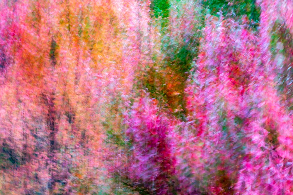
A photo of fall leaves on the trees with intentional camera movement blurring all the colors together
When I was learning photography, I was shooting with an SLR 35mm-film camera and shooting almost exclusively in black and white.
It's not just that black and white was artsy for us visual arts students, it's that black and white was the standard because it was cheaper and easier to teach and learn in the darkroom.
It wasn't until my senior year of college that I had an opportunity to work with the color enlarger.
At UCSD, they only offered the color class once a year, and they only accepted six people into the class because they only had one small closet of a room with all the necessary color equipment, including only one color enlarger.
That's when my mind was blown by the complexity of color printing.
Here's one small example. I went and took some photos at the beach (surprising, right?).
It was a beautiful day and the photos were exposed perfectly so I didn't have to fuss much with exposure, burning, or dodging when I was printing. I was only concerned with getting the colors right.
As I recall, the first print came out with a very pink cast and some especially pink-looking clouds.
Oops. Not what I was going for.
Intuitively, if you want less pink in the sky, you'd look for a way to dial in less pink? (There are actual dials on a color enlarger for yellow, magenta, and cyan).
Well...it doesn't work that way.
Instead, you ADD magenta to block the dominant magenta.
If the dominating color was green and you wanted less green, you would SUBTRACT some magenta.
In color printing, you work with red, green, and blue (they're not really primary colors but that's a whole different post!).
You also work with the complementary colors of magenta, yellow, and cyan. So, you do a lot of adding and subtracting colors to get the print the way you want it.
It sounds complicated but after you master the basics, it's not too bad, and I enjoyed working with the color enlarger.
I love working with color to evoke moods, and sometimes I change a photo quite a bit using only color.
For demonstration purposes, here's the same photo edited two ways.


The second photo is color-toned to look more "cinematic." That turquoise sky with reddish highlights is something you see in the movies a lot.
I edit my photos based on what I'm trying to achieve, and that's different for every photo, though in general, I'm aiming for a surreal or painterly look in a lot of my photos.
It's not always easy to achieve!
Most of the time, I think the way color affects us is subconscious. When you look at a print or piece of art, you usually have an immediate reaction. You either like it or not.
Of course, there are many shades in between - I LOVE it! I sort of like it, it's okay, not really my cup of tea...you get the point.
When you're choosing art for your home, choose something you love but also think about how color affects your mood.
Although some colors are associated with certain moods, it's still a very personal thing. My mom would never paint a bedroom blue. She says it's too depressing.
I love blue in the bedroom, as long as it's not too dark.
One mistake I have seen people make is buying a really colorful piece only to discover it clashes with their paint color.
I have a small house so I painted it one color throughout the entire house - Agreeable Gray from Sherwin Williams.
It makes the house feel a little bigger to carry the same paint throughout, and because it's neutral, I can change my art around without worrying much about color.
I've had the same print on the wall above the couch for several years:
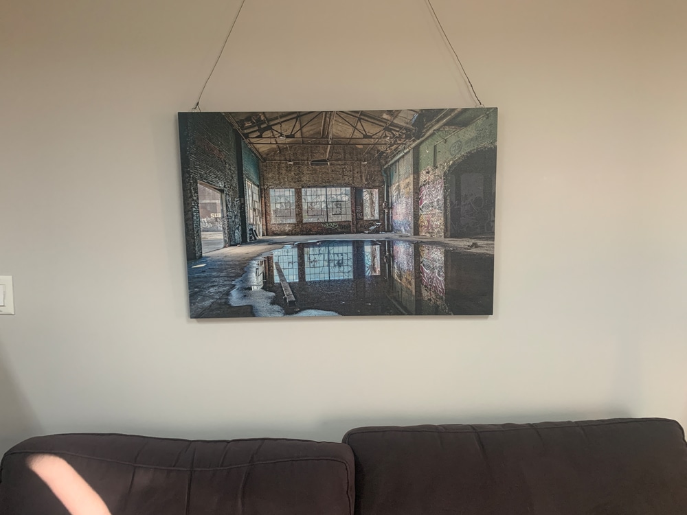
I love the muted colors, and the photo is very peaceful to me because I remember being there and taking the shot.
I also had the print left after it had been on a gallery wall at a local cafe for the month, so it was an easy choice!
I'm ready for something bolder, bigger, and more colorful, so I'm thinking of printing the above shot I used for the cover of this blog post and changing it out. We'll see how long it takes me to get around to it!
If you're thinking of getting some art for your walls, remember to look at all the factors - the wall color, furniture color, and your personal tastes.
If you're buying art for your place, don't let someone else sway you - get what YOU like. That's what art's about!
Have a great rest of your week, and see you between the raindrops!
xoxo,
Susan
PS - I haven't added the cover photo onto the website but I'm thinking about adding an abstract gallery soon. I'll let you know when I do. In the meantime, you can find more photos here.
This is only visible to you because you are logged in and are authorized to manage this website. This message is not visible to other website visitors.
This means you can use the camera on your phone or tablet and superimpose any piece of art onto a wall inside of your home or business.
To use this feature, Just look for the "Live Preview AR" button when viewing any piece of art on this website!
This means you can use the camera on your phone or tablet and superimpose any piece of art onto a wall inside of your home or business.
To use this feature, Just look for the "Live Preview AR" button when viewing any piece of art on this website!

SAVE 15% ON YOUR FIRST ORDER!
Plus exclusive access to new releases and VIP discounts!
This offer is valid for NEW CUSTOMERS only!